 Faylen's Skinning Tutorial 2 - Selective Recolor, Adding a Simple Texture
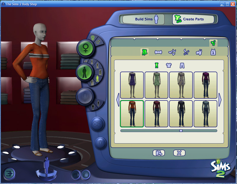
Welcome to part two of my skinning tutorial series. If you are reading this, I am assuming that you have either gone through part one, or played around a bit enough to know how to open body shop, select an item to recolor, exported it to your image program, edited it in some way, and imported it to your game. All these steps are covered in the first tutorial. I am also assuming that you >have< an image editing program. I am using PhotoShop CS version 7.0, but you can use any other program that can create layers. Go to the
Skinning FAQs thread, which is stickied in both this forum and the regular Skinning forum. Get your image program. Play with it, and learn what tools it has - most of what I show you here in Photoshop will be somewhere in your image program, maybe in a different place, but looking for it on your own will also teach you how to more effectively use the tools you have.
In this tutorial, we're going to do a few things that are more complex than just recoloring. I chose this outfit for a couple of reasons. First, the colors of the different parts of the outfit are very different from one another, making it easier to select the top only (or the bottom only!) Second, it is a very simple shape with few details to work around on the mesh. Third, it has a bump map (NormalMap.bmp, which you'll see when you open the project up.), which adds shadows and highlights that make the outfit look more three-dimensional. This means we don't have to get too worried about shadows and highlights in the texture layer.
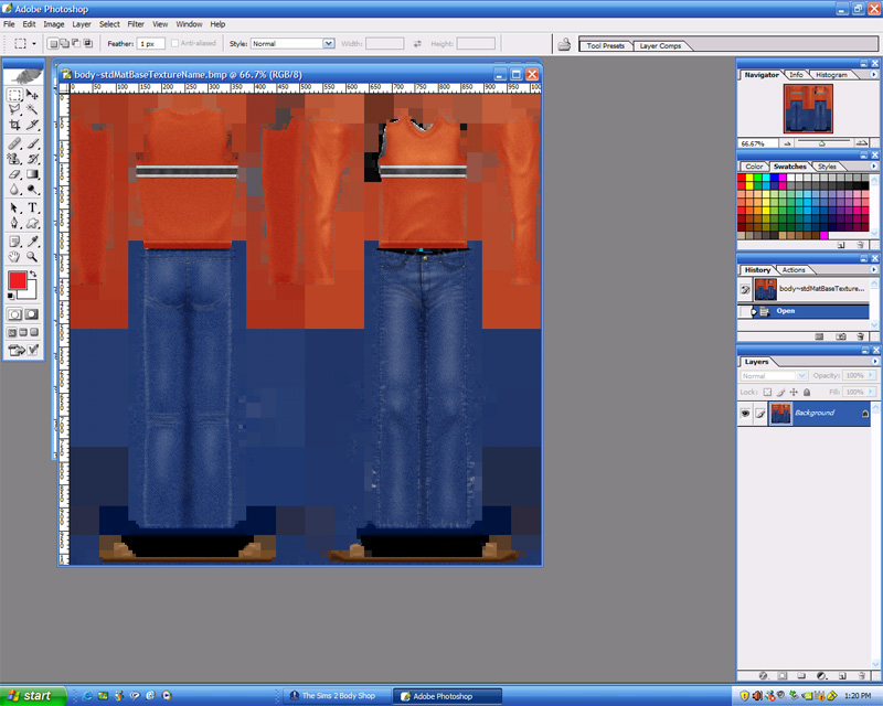
Now, as I said, you should already have learned how to export the outfit and then open the texture.bmp file in your image program, from the first tutorial or your own playing around, so I've skipped those steps. Here is our texture image. The first thing I want to do is get rid of those stripes. Not only do I not like them, but I want a solid color for the top.
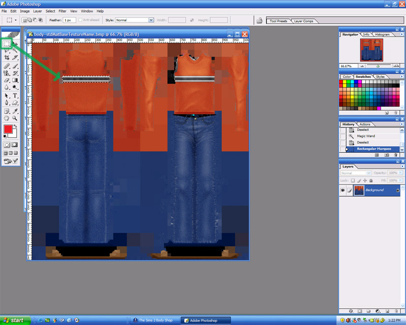
So. . .using your marquee tool, select the back stripe. You'll see why in a few steps. Make the rectangle a slight bit larger than the stripe.
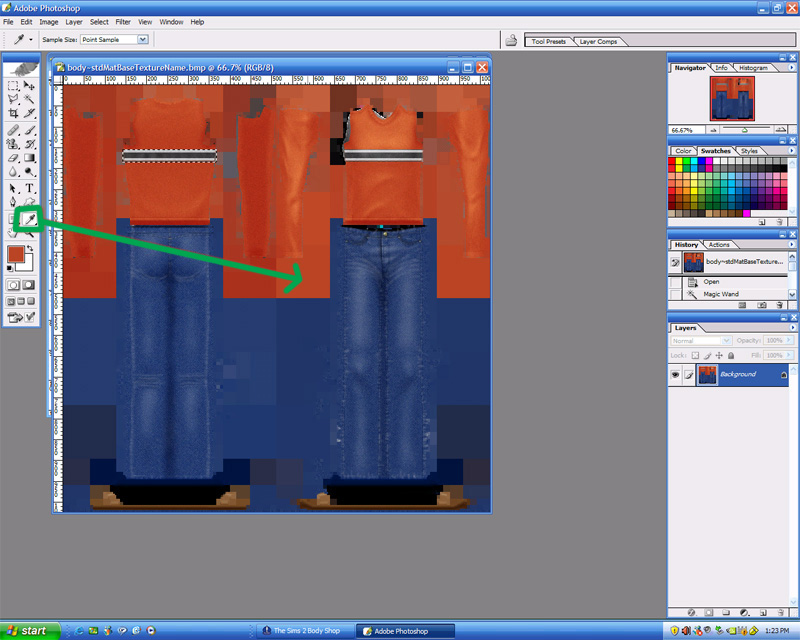
Now, see the eyedropper tool? We're going to click that, mouse our eyedropper over to the lighter orange and click. Why? Because it's a lot easier to pick a lighter color and make it darker than the other way around, IMO. Plus, I already know we're going to use a Filter tool that will darken this color a bit.
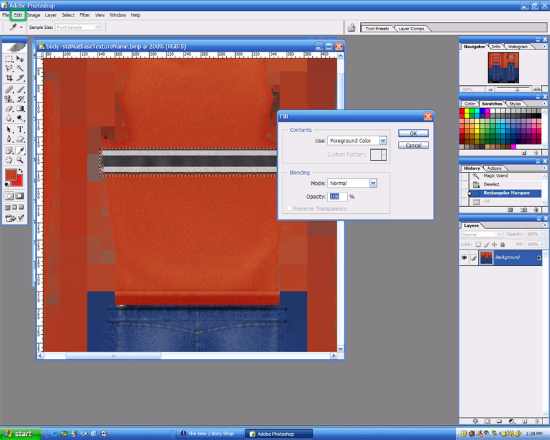
I've skipped a picture here, because you really don't need it. This is easy. From your Edit menu (in the green box on top) you select "Fill", which brings up the box you see in the middle. When we used the eyedropper to pick up the light orange, that became our foreground color, so in that box, I want to use Foreground Color, Normal mode, and 100% opacity so that the rectangle gets filled completely with the orange. For other projects, you might change the settings for the fill in the box. It's not a really versatile tool, but it does come in handy a lot.
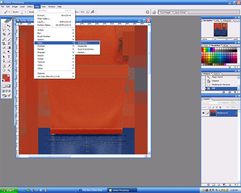
In PhotoShop, the Filter menu can be a really, really good friend! In fact, because I play around with filters, I knew right off that the speckly texture on the rest of the shirt was just Noise. So, that's what we're opening up here.
Look at that!
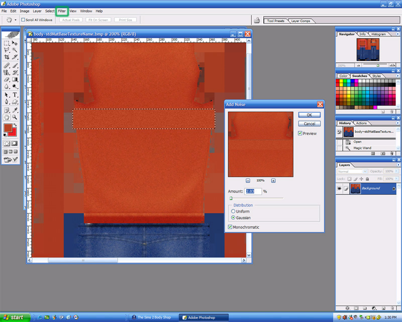
Note, also, that you have a few variables in the Add Filter box. You might need to change the amount of Noise, the spread, etc. All the filters can be tweaked for different effects. Play with them. But for now, this is exactly what we want.
Now, you could always do the same thing with the front stripe, but if you look where it is, you can see that it's smack dab in the middle of some highlighted texture. We're going to want to extend those highlights into our former stripe area without altering the original texture, so all we really need to do is leave the marquee around the stripe we filled on the back, and Copy, then Paste, from the Edit menu. The stripe will appear right on top of the original, so click on your move tool (the tool at the top right of the tools menu that looks like a triangle and four-way arrow) and move it over the front stripe. You'll see that you now have two layers, so you can alter the stripe all by itself.
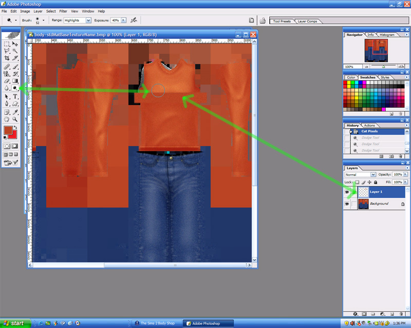
Using the Dodge tool, which lightens (and look at the top line - I've selected Highlights and lowered the exposure a bit so that the lightening will not be too drastic!) Next to "Brush" is a little drop-down arrow. It will bring up all your different brushes, and once you choose one, you can further alter its size with a slider in the drop-down box. I chose a brush that's a little faded around the edges, and selected a size that's a bit smaller than the original highlighted area on the base texture.
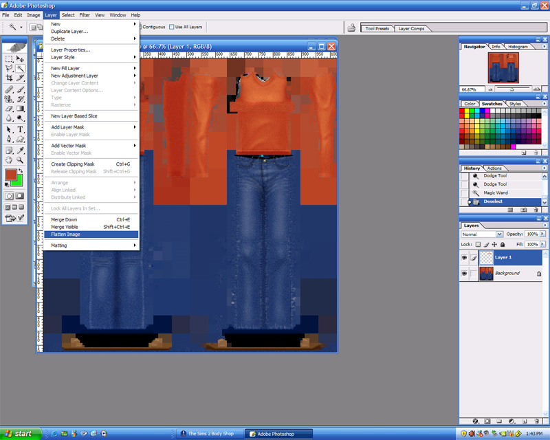
After I've extended the highlights into the stripe and decided I like it, it's time to Flatten the image, which you will find in the Layer menu. This makes the whole thing a single image, so I can select the entire shirt - including the newly filled areas.
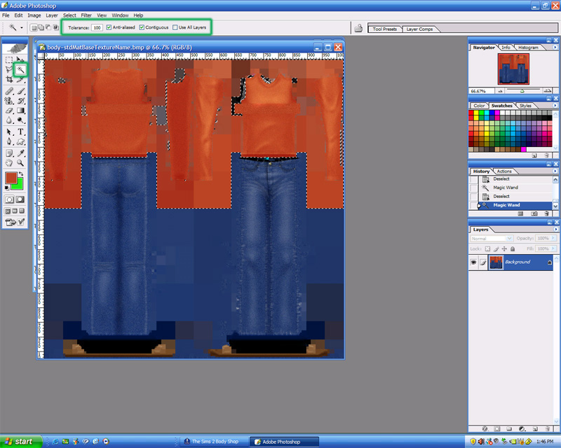
There are a few ways to do this. In the
original part two, I used the polygonal lasso to select the area I wanted to change. You can still do that - it's simple. Right click on the Lasso tool, which you can see right below the Marquee tool and to the left of the green boxed Magic Wand tool. You click on each point you want to be inside the shape you're recoloring until you have an entire multi-sided "box" enclosed. However, I wanted to show you another tool here. Since we have this bright orange in only one area, we can use the Magic Wand to select only that color. Now, up at the top, in the green rectangle, you have some options. The Tolerance is a number you can adjust by clicking to highlight and just typing in new numbers. The higher the tolerance, the more colors close to the one you select will be included in your selection. Anti-aliased refers to the quality of the image, not really applicable in this case, so just leave it checked. Contiguous means only the areas where the selected color range touches. In this case, it means that if we had orange shoes, too, they wouldn't be included in our selection. We have only one layer, so it doesn't matter whether we've checked Use All Layers.
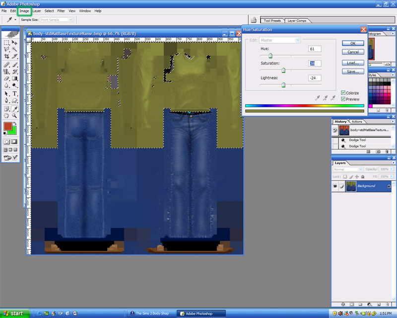
Now, from the Image Menu, we pick Adjustments, then Hue/Saturation, and check Colorize in the pop out box, just as we did in the first tutorial. Why? Because I don't want an orange shirt, that's why.
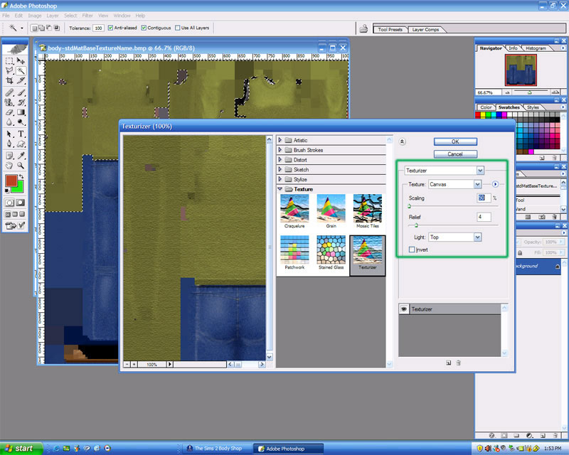
And now for more fun with filters! You can see just from the list that you have all kinds of Filter toys to play with. We're going to use Texture>Texturizer. I highlighted the box for a couple of reasons. First, to show you that after you've chosen your filter, you can still play with more stuff. Second, to show you that I adjusted the Scaling. We're talking Sim clothes here, and if you don't scale the filter down, the texture is going to look like bad Barbie clothes.
Also, this is why we had to add Noise to the stripe to make it match the rest of the shirt - the filter applies to everything selected in the same way. Without noise, our solid fill stripes would look glaringly different from the rest of the shirt.
Here you can see what we're starting to get at. (You know, of course, from the first tutorial, that we used "Save As" and overwrote the original texture, then refreshed in Body Shop, because you read the first tutorial.) You can also see that even though our filter lessened the shadows and highlights of the texture, they're still pretty visible, thanks to the bump map.
The bad thing is that it's a little hard to see the edges, and for the next few steps, we want to know where they are. So, we open up our alpha file, Select All (from the Select menu at the top) copy it, and paste it over the texture.
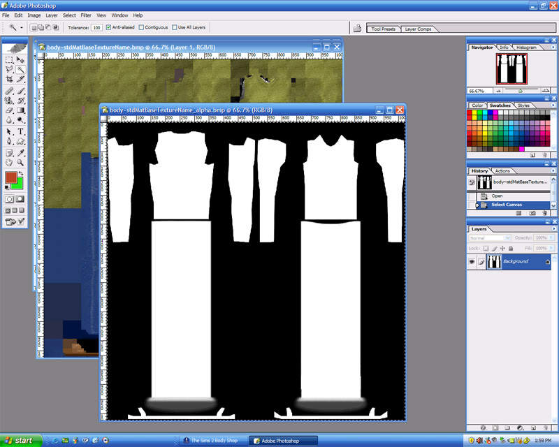
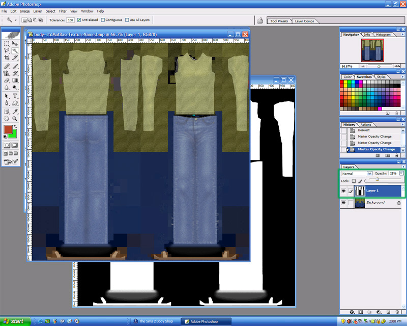
Oh, no, now we can't see our texture! Never fear, look at the green box on the right. Pasting made a new layer, as you can see from the thumbnail, and all we have to do is click on the Opacity, and slide the slider until we can see through the image of the alpha file.
This part is going to make all of you who like to make t-shirts very happy. We're going to take an image from somewhere else and. . .paste it onto the front of the shirt. I found this butterfly, which is a really good image because the background is a solid color, making it easy to copy only the image I want.
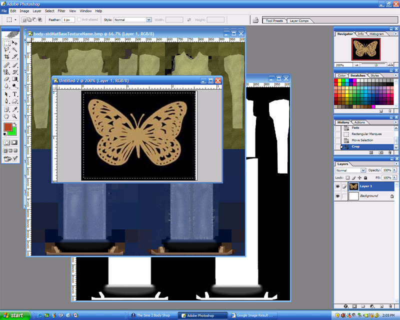
Using the Magic Wand tool again, unclicking "Contiguous" so I can get the black inside the wings, too, I click anywhere on the black.
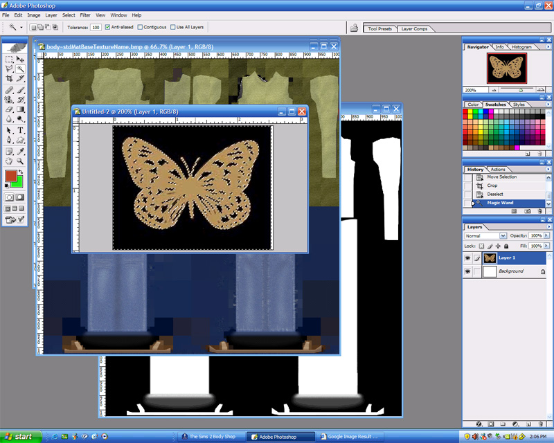
I want to be able to copy only the butterfly part, making the shirt show through the black inside the wings so that it looks kind of like a lace applique. You very well might not care to do this, but since it's something that can come in handy many other times, I'm going to show you. From the Layer menu, I select Add Layer Mask, then Hide Selection. This basically eliminates the black part from the image.

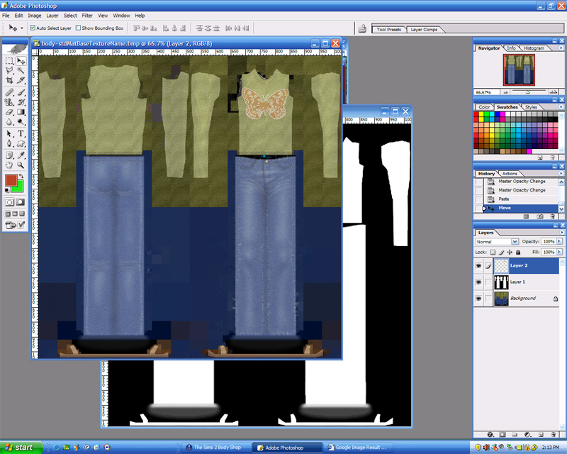
I flattened the butterfly image, used the Magic Wand again to pluck up my butterfly, then Copied. I pasted onto the shirt, used the move tool again (because your image will pop up right in the middle) and used the outlines of the alpha image layer as a frame of reference for placing the butterfly.
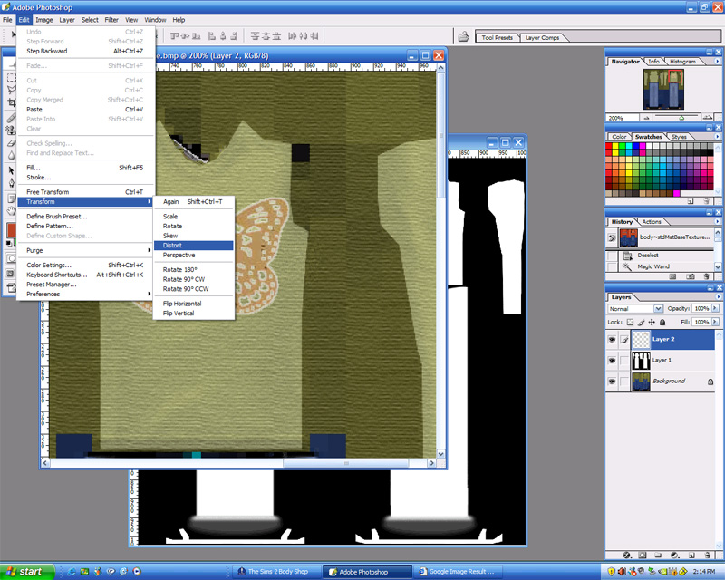
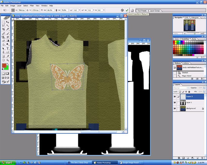
After a Save As in PhotoShop and a Refresh in Body Shop, it was obvious that this butterfly was way too big, and stretched funny across my sim lady's chest. So, from the Edit menu, we select Transform>Distort.
This gives us a box with several adjustable points - click and drag. I think the shape looks a bit better, narrowed across the bottom where the image is going to get stretched. Of course, we have to move it again.
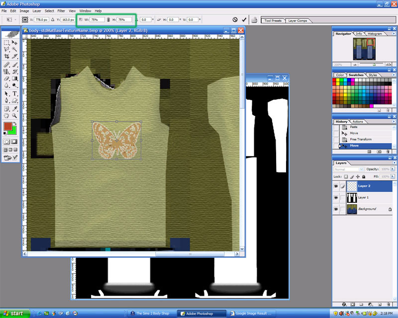
After a Save As/Refresh, I decided that the image was just a bit too big, still, but the shape was working. So, back to the Edit menu - this time when we select Transform, we're going to choose Scale instead of distort. This changes the vertical and horizontal of the image, and you can either drag to enlarge or shrink, or manually change the percentages, as you can see in the green box. This is handy if you want to keep the image the same proportions, just bigger or smaller.
Notice the difference between the bottom width of the image in your texture file, and here on the sim? Just as with real fabric, if it gets stretched across a wider part of the body, it's going to get distorted.
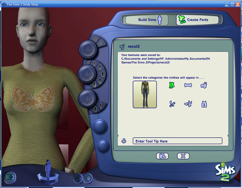
And this is just the result of playing around with Filters and Colors. You can do whatever you want to the butterfly - it's a separate layer, so it won't affect the base texture of the shirt, and you can always go backwards if you don't like how it changed. (The color of the shirt changed because once the butterfly was the right size and shape and in the right position, I made the opacity of the alpha image layer Zero. But I didn't discard it, because we're not done. The bare neckline and cuffs bother me. . .)
Moving the opacity up again, I can see where I actually have a neckline and cuffs. I used the eyedropper tool again, picked up the purple from the butterfly, and began brushing from the edge of the neckline inward until it was thick enough to show on the Sim in Body Shop.
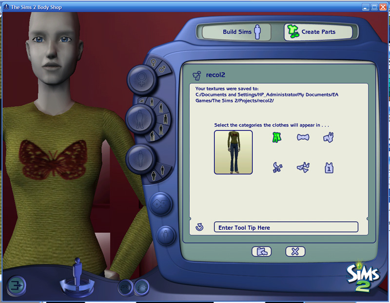
Now, I was going to go back and retake this image because there's a mistake on it, but I decided to leave it to point out something that happens to me all the time when I'm creating and not paying attention. Notice which layer is highlighted. Not the texture, which is what I wanted to be drawing on, but the alpha image, which I had just changed the opacity on. That means that my color was being applied to the wrong layer! Another thing you'll find sometimes is that if you use any of the selection tools, like lasso or marquee, and then try to paint, nothing will happen, because you have to click with the selection tool a second time to get rid of the selection.

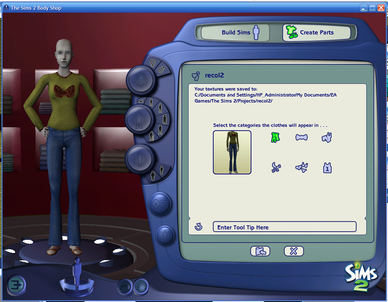
So here we have our finished product, recolored, retextured, with an image pasted on, and colored with the brush tool. You learned a lot, didn't you? Now go play!
 Sign in to Mod The Sims
 5th Aug 2006 at 1:55 AM
Last edited by leefish : 20th Dec 2013 at 11:51 AM.
5th Aug 2006 at 1:55 AM
Last edited by leefish : 20th Dec 2013 at 11:51 AM.
