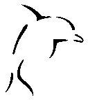
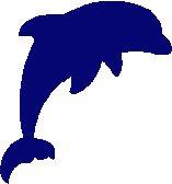
 Mini-Tutorial: Making Custom Icons which Do Not Hurt One's Eyes
When making custom majors or careers, you'll almost always want to make a custom icon to go with them. However very often icons are made too big, with non-functioning magic pink backgrounds, or are just cropped out of photographs. When used alongside Maxian careers/majors icons like this break continuity, and when used alongside other custom careers/majors, they just look like a jumble of mess.
This mini-tutorial will explain how to easily make a neat and clean looking icon. It will not teach you how to use a graphics editor! However, it also won't require any advanced skills, so you certainly don't need to be an expert. If you're really clueless as to how to use yours, look up some tutorials on Google first.
If you don't already have a graphics editor, you can download
the GIMP for free. Anything else such as Photoshop or PaintShop Pro will be fine too.
You cannot use MS Paint!
 Finding a Source Image
Most of the time, you'll have some idea of what you want your icon to be - but won't have anything to base it off. If you plan to hand draw your icon, you can skip this bit.
As inspired by the set of wooden dolphins on my windowsill, we shall here find a suitable image with which to create an icon of a dolphin. Maybe not something anyone is ever likely to write a career around, but variety
is the spice of life, after all.
As with everything computer-related, if you want it but don't have it, Google is your friend. However you'll soon see that Google is one of those intensely annoying friends who never gives you a straight answer. A Google image search for
dolphin, for example, brings up lots of pretty photographs of dolphins. All of which are utterly useless.
You remember that school teacher who, whenever you said "Please can I go to the toilet?" responded with "Well, I sure hope so. Maybe you should go to the doctor if not." ? That's Google. You have to ask it for
exactly what you want. Adding the right words can work wonders - a few that are often useful include icon, silhouette, cartoon, clipart, logo - and you'll pick up a few more with practise.
As you'll see, adding those to your search terms improves the results by a long way. Searching for
"dolphin icon" gives us lots of useful results.
Your image should not be...

Overly detailed, or have text on it. You're going to make this image very very small. What starts out like this:

Will end up like this:


You should use an image with a complete outline, or something very close to it. You'll have to expend a lot of effort hand drawing the outline if you use anything like this:

 Do not
 use a straight photograph. Just don't do it.
Once you've found your image, paste it into your graphics editor. We'll use this one as an example:
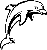
 Turning it into an Icon
This bit is fairly simple. A bunch of things to get right, but they're all easy so long as you know of them.
Colour
First off, is that thing you know never to do in any other area of modding. The thing which is reject-worthy in clothing and object recolours; the forbidden bucketfill.
Open the colour selection screen for your bucketfill tool, and set the colour value to R:5 G:6 B:113. It should look something like this:

This colour is Maxis Blue, and it will
always be the only colour used in your icons. You can fiddle with transparency, have translucent edges etc - but you never change that colour!
Now - bucketfill! Make sure to get all the little fiddly bits. If your source image is multicoloured, or you find that you get bits of stray colour at the edges of bucketfilled areas, you probably need to turn your bucketfill Tolerance up. The option should be in Tool Options or similar - about 80 is a good value to use for this, 100 is bad!
If your bucketfill is just covering up everything, regardless of tolerance, make sure you have it set to RGB value/colour match mode - this should also be in Tool Options. Once you're done, you should have this:
 Size
Size
Now we see why text and fine detail is such a bad idea. We're going to resize the icon. In order to have it fit in the space given by the UI, without overlapping the text; we're going to make our icons 36x36 pixels. Told you they were going to be small.

Resizing often presents problems. It may be you need to Undo the resize and delete or paint over something. With our dolphin, the lower fin on the far side is made completely unrecognisable:

In this case it's probably easiest to delete the fin on the 36x36 image, which leaves us with this:

This looks a lot better, but is a bit rough around the edges. We'll smooth it off shortly, but first we need to get the background right.
Background
This is the thing most often forgotten by creators.
You must use a transparent background! It doesn't matter how well made the icon is, if it pops up on the UI with a big block of white around it, it will look tacky.
Any good graphics editor has an option to change the background colour of an image. But I'm using PSP7, so we'll do it the long way instead.
Make a new image, 36x36, 64 Bit, background colour Transparent. Now select all of your current icon, and copy it. Paste it onto your new image as a new layer. The colour may get mottled when you paste - if so just bucketfill over it again. Now whip out the eraser tool (this time at 100% opacity), and get rid of all the whitespace.
Now our icon is looking as it did before, and is now on a transparent background. It still has those annoying rough edges, though.
To smooth it off a bit, we can use an eraser tool set to about 30% opacity to make those ugly corners look less juddery. One click of the eraser on each corner pixel usually works well, and the image should start to look smoother:

And there you have it. Save as a png, or another format which supports transparency, and you have a perfect icon.
 In Summariness
 (Yes, you may groan)

Use an image which can easily be bucketfilled into a silhouette, with no fine detail or text

Do not use a photo!

Use the colour R:5 G:6 B:113

Use 36x36 pixels

Have a transparent background. Note - magic pink is ok if it works ingame, but put the icon on a white background for the upload thumbnail.
And now you can upload careers and majors without causing the queue moderator to put on sunglasses!

What I lack in decorum, I make up for with an absence of tact.
 23rd Jan 2008 at 7:06 PM
Last edited by whiterider : 23rd Jan 2008 at 7:14 PM.
 25th Jan 2008 at 12:28 AM
 25th Jul 2008 at 11:55 PM
 8th Aug 2008 at 12:49 PM
 17th Oct 2008 at 5:07 PM
 31st Jul 2010 at 3:59 AM
 7th Feb 2011 at 6:39 PM
 15th Dec 2011 at 1:26 PM
 6th Mar 2015 at 2:00 PM
 23rd Sep 2015 at 11:00 PM
 23rd May 2019 at 4:49 AM
 31st May 2019 at 4:52 AM
 3rd Jun 2021 at 11:34 AM
 4th Jun 2021 at 8:15 AM
Last edited by topp : 4th Jun 2021 at 8:29 AM.

 Sign in to Mod The Sims
 Overly detailed, or have text on it. You're going to make this image very very small. What starts out like this:

